Introduction
In the highly competitive world of publishing, the adage "don’t judge a book by its cover" is statistically incorrect. A potential reader makes a subconscious decision to investigate a book further within milliseconds of seeing its cover. For self-published authors and independent publishers, the cover is the single most important marketing asset. However, creating a high-converting cover is not merely an artistic endeavor; it is a data-driven process rooted in deep market research.
Successfully navigating book cover design requires a delicate balance between creativity and commercial viability. To achieve this, one must master the art of researching book cover trends and adhering to genre standards. A cover that stands out for the wrong reasons—by ignoring the visual language of its category—often fails to connect with its target audience. Conversely, a cover that blindly copies trends without nuance risks disappearing into the noise.
This comprehensive guide will walk you through the professional strategy for researching design trends, analyzing genre expectations, and conducting a competitor audit. By the end of this article, you will understand how to bridge the gap between artistic expression and market psychology to create a book cover that not only looks professional but actively sells your narrative.
The Critical Role of Genre Standards in Design
Genre standards are the visual shorthand that tells a reader exactly what kind of experience they are about to buy. Before a reader reads the title or the author’s name, the color palette, typography, and imagery composition signal the genre. If you place a thriller novel inside a cover that utilizes the pastel palette and illustrated vector art typical of a contemporary rom-com, you will attract the wrong audience and alienate the right one.
Why Readers Crave Familiarity
Human brains are wired to recognize patterns. When browsing Amazon or a physical bookstore, readers scan for familiar cues that promise a specific emotional payoff. A high fantasy reader is looking for sweeping landscapes, metallic typography, and perhaps a hooded figure. A business non-fiction reader is looking for clean, bold sans-serif fonts and minimalist conceptual art. These genre standards act as a promise. Breaking this promise confuses the consumer, leading to lower click-through rates (CTR) and poor sales performance.
Balancing Originality with Expectations
The goal of research is not to clone the bestsellers, but to understand the boundaries of the sandbox you are playing in. Effective design manages to be 80% familiar and 20% unique. The familiarity gets the reader to stop scrolling; the uniqueness convinces them to click. Researching trends allows you to identify which elements are non-negotiable (e.g., dark, moody lighting for horror) and where you have room to innovate (e.g., a unique title treatment or perspective).
Step-by-Step Guide to Researching Book Cover Trends
Researching book cover trends is a systematic process. It involves moving beyond subjective taste and analyzing market data. Here is how professional designers and strategists approach this phase.
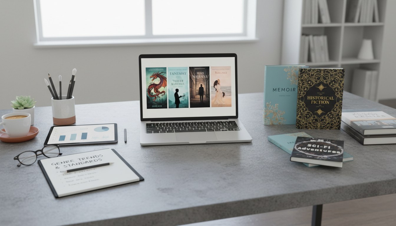
1. Analyze the Amazon Top 100
Amazon is the largest search engine for books and your primary source of data. Do not just look at the overall Top 100; drill down into your specific sub-genre categories. If you are writing a "Cozy Mystery," navigate to Books > Mystery, Thriller & Suspense > Mystery > Cozy.
Once there, capture screenshots of the top 20 selling books. Place them side-by-side on a digital canvas. Look for the common denominators:
- Color Grading: Are the covers warm (oranges, yellows) or cool (blues, greys)?
- Layout: Is the title text at the top, middle, or bottom? Is the author name larger than the title?
- Imagery: Do they feature real photographs, 3D renders, or illustrations?
2. Identify Visual Tropes and Symbols
Every genre has recurring symbols—often called tropes—that signal specific plot elements. In psychological thrillers, you might see a lone silhouette, a house with one light on, or shattered glass. In regency romance, you might see headless torsos in period clothing or sweeping ballgowns. Identifying these tropes helps you decide which ones to employ to signal your sub-genre instantly.
3. Typography and Font Analysis
Typography is often where amateur covers fail. During your research, pay close attention to font treatment. Are the bestsellers using Serif fonts (with feet) or Sans-Serif fonts (sleek, modern)?
- Serif Fonts: Often used in Literary Fiction, Fantasy, and Historical Fiction to denote prestige, history, or elegance.
- Sans-Serif Fonts: Dominant in Non-Fiction, Thrillers, and Sci-Fi for a modern, urgent, or factual feel.
- Script/Handwritten: Common in Romance and Memoir to imply intimacy or personality.
Note the texture of the text as well. Is it metallic? Distressed and grunge? Clean and flat? These subtle details contribute significantly to the "pro" look.
Decoding Genre-Specific Design Elements
To illustrate how drastically trends vary, let’s analyze the current design standards of major genres. Understanding these distinctions is vital for your book cover trends research.
Thriller, Mystery, and Suspense
The visual language here is about tension. Current trends lean heavily toward large, bold typography that interacts with the background image—perhaps a character stepping over a letter, or the title obscured by fog. High-contrast colors are essential, often utilizing yellow or red text against a black or dark blue background. The imagery is rarely clear; it is shadowed, blurred, or fragmented to imply a mystery that needs solving.
Romance and Contemporary
This genre has seen the most significant shift in recent years. The "clinch" cover (photorealistic models embracing) has largely given way to the "illustrated romp." Bright, vector-based illustrations with bold, blocky colors are the current gold standard for contemporary romantic comedies. However, darker romance and erotica still rely heavily on moody photography and object-based symbolism (masks, ties, flowers).
Science Fiction and Fantasy (SFF)
SFF covers are selling "world-building." For Fantasy, the trend is intricate borders, metallic gold or silver stamping effects, and typography that looks forged. Sci-Fi trends fluctuate between the "Space Opera" look (spaceships, planets, starfields) and the "High-Tech" look (abstract geometric shapes, neon glitch effects, and minimalist data visualization).
Non-Fiction and Self-Help
Clarity is king. The current trend in non-fiction is "Big Type." The title often occupies 80% of the cover space, using heavy, bold sans-serif fonts. The background is usually a solid color or a very subtle gradient. If imagery is used, it is often a singular, clever conceptual icon that represents the problem or solution. The goal is to communicate authority and immediate value.
The Psychology of Color in Market Research
When conducting your research, map out the color psychology of your competitors. Colors evoke specific chemical responses in the brain, and successful covers leverage this.
- Red: Urgency, danger, passion, aggression. (Thrillers, Romance, Politics).
- Blue: Trust, intelligence, calm, cold technology. (Business, Sci-Fi, Sad Memoirs).
- Yellow: Optimism, warning, high energy. (Self-help, Thriller highlights).
- Black/Dark Grey: Mystery, luxury, seriousness, death. (Horror, Crime, Premium Non-fiction).
- White: Purity, space, cleanliness, stark reality. (Literary Fiction, Minimalist wellness).
If the Top 50 books in your category are all blue and yellow, releasing a pink cover is a risk. It might stand out, or it might be subconsciously rejected as "not belonging" to the genre.
How to Conduct a Competitor Audit
Beyond the bestseller lists, you need to research your direct competitors—authors who are at the level you aspire to be. This is a "Comp Title" audit.
Selecting Your Comparables (Comps)
Identify 3-5 books that are similar to yours in tone, content, and target audience. These books should have been published within the last 1-3 years. Analyzing a bestseller from 10 years ago is useless because design trends move fast. Look at their covers: What emotion do they convey? How detailed is the background? Do they focus on character or setting?
Creating a Mood Board
Compile your research into a mood board. You can use tools like Pinterest or Canva. Create sections for:
- Must-Haves: Elements that appear on 90% of competitor covers (e.g., a spaceship for Space Opera).
- Typography Inspiration: Font styles that catch your eye and fit the genre.
- Color Palettes: Swatches extracted from top-performing covers.
- Don’ts: Elements you see on poorly performing books (e.g., amateurish CGI, unreadable fonts).
This mood board serves as the design brief for your graphic designer or as a blueprint if you are designing it yourself. It moves the conversation from "I like this" to "The market responds to this."
Avoiding Fleeting Fads vs. Investing in Long-Term Trends
A critical part of research is distinguishing between a solid trend and a fleeting fad. A trend is a shift in aesthetic that lasts for years (e.g., the move toward flat design). A fad might last six months (e.g., a specific neon green filter popularized by a single viral book).
Be cautious of AI-generated art trends. While AI is a tool, early AI covers often share a distinct, overly-smooth, "plastic" look that readers are beginning to recognize and associate with low-effort publishing. As of now, the market standard still favors human-designed composition, even if assisted by digital tools. Investing in a cover that looks too generic or "fad-heavy" ensures your book will look dated within a year.
Frequently Asked Questions
1. How often do book cover design trends change?
Major design shifts usually occur every 3 to 5 years. However, micro-trends (like a specific font becoming popular) can cycle annually. It is recommended to refresh your book cover if it is more than 5-7 years old to ensure it still competes with modern publications.
2. Can I break genre standards and still succeed?
Yes, but it is a calculated risk. This is known as "disruptive design." To pull this off, the design must be exceptionally high quality. Usually, established authors with a built-in fan base can afford to break rules more than debut authors who rely on genre signals to attract new readers.
3. What are the best tools for researching book cover trends?
Amazon Best Seller lists are the primary source. Pinterest is excellent for visual curation and spotting aesthetic shifts. Goodreads lists (e.g., "Best Sci-Fi of 2024") allow you to see what avid readers are voting for. Additionally, sites like Behance or Dribbble can show you what professional designers are creating before it hits the mass market.
4. Should I copy the bestsellers exactly?
Absolutely not. Copying is plagiarism and legally actionable. Furthermore, if you copy a bestseller exactly, your book will look like a cheap knock-off. The goal is to emulate the feel, the structure, and the mood, not the specific artwork.
5. How does thumbnail size affect design research?
Crucially. Most customers will first see your book as a tiny image on a mobile phone. When researching, zoom out until the covers are postage-stamp size. The best designs still have readable titles and a clear focal point even at that scale. If a cover looks messy or illegible as a thumbnail, it fails the Amazon test.
Conclusion
Researching book cover trends and adhering to genre standards is not about suppressing your creativity; it is about channeling it into a language your readers understand. The cover is the bridge between your story and the reader’s imagination. By analyzing the Amazon Top 100, decoding color psychology, and conducting a thorough competitor audit, you remove the guesswork from the design process.
Remember that the publishing market is dynamic. What sells today might shift tomorrow. Therefore, viewing cover design as an ongoing marketing responsibility rather than a one-time task is essential for long-term success. Whether you are hiring a professional designer or taking the DIY route, let data be your compass. A well-researched cover does the heavy lifting of marketing for you, turning browsers into buyers and manuscripts into bestsellers.